BACKGROUND
If you’re familiar with CSS, you have probably used :hover pseudo-states. A typical scenario for this grammar is to signify state changes for clickable elements.
For example, when we write:
1 | button { |
Without other interferences, this will fade the button opacity to 0.9 when the user’s mouse is hovering over it.
Proper use of the :hover pseudo-state is important. It conveys information to users on which element is clickable, and which is not. cursor: pointer is often paired with :hover to perform richer and more precise feedback for user interactions.
The problem is, :hover is designed exclusively for desktop devices. Since 2007, smartphones and other touch devices became increasingly popular. Obviously, there are no corresponding actions for mouse hovering on touch devices.
Despite that, most of the browsers for touch devices implemented support for the hover state, but instead of mouse hovering, the trigger became a touch start event.
To describe the behavior logic concretely:
When your finger presses on an element, both of its
:hoverand:activepseudo-states are triggered. When the finger leaves the screen, the:activestate is removed, whereas the:hoverstate stays until another element is pressed.
Here, the “stays until another element is pressed” behavior looks somewhat identical to another pseudo-state :focus, which also loses its active status on another touch event start. And this period of stay is the topic of this article - Sticky Hover.
STICKY HOVER
There may be personal feelings, but sticky hover can be anathema to user experience.
When we tap on a button and then lift our fingers, we always hope that the action is instant and clear-cut. Such a sticky style, however, gives the impression that the action has not been done yet. The active style persists on the screen and continues to disturb users’ visual experiences.
The common feeling of “web apps are inferior to native apps in terms of user experience” can be partially ascribed to sticky hovers. On StackOverflow, there have also been discussions on how to disable this specific behavior.
In fact, when W3C developed the relevant web standards, it did not show any positive attitude towards such an interaction logic. The following is a definitive explanation of the CSS dynamic pseudo-classes in the standard drawn by W3C:
Interactive user agents sometimes change the rendering in response to user actions. Selectors provides three pseudo-classes for the selection of an element the user is acting on.
The :hover pseudo-class applies while the user designates an element with a pointing device, but does not necessarily activate it. For example, a visual user agent could apply this pseudo-class when the cursor (mouse pointer) hovers over a box generated by the element. User agents that do not support interactive media do not have to support this pseudo-class. Some conforming user agents that support interactive media may not be able to support this pseudo-class (e.g., a pen device that does not detect hovering).
The :active pseudo-class applies while an element is being activated by the user. For example, between the times the user presses the mouse button and releases it. On systems with more than one mouse button, :active applies only to the primary or primary activation button (typically the “left” mouse button), and any aliases thereof.
The :focus pseudo-class applies while an element has the focus (accepts keyboard or mouse events, or other forms of input).
Notice that when suggesting the trigger for the :hover pseudo-state, W3C explicitly pointed out that user agents that do not support hovering interaction (e.g., a pen device that does not detect hovering) do not have to support this pseudo-class as well. Here, touch devices are essentially the same as the pen device example. Therefore, a conforming user agent should not implement the trigger of :hover pseudo-state if they comply with the standard.
But why do all touch browser implementation vendors violate this standard in the same way?
The one reason that I can come up with is style completeness in all its possible behaviors.
STYLES COMPLETENESS
Let’s use the button introduced earlier in the article. Suppose it has three states: the normal state, the :hover state and the :active state, each with a different style declaration.
1 | button { |
Apparently, in a traditional desktop device controlled by mouse, the button can display three distinctive style combinations, i.e., the normal style, the style with 0.9 opacity and with 0.9 opacity plus a scaling transform:
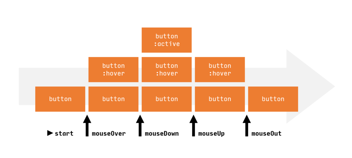
These three style combinations are all the expected styles in this particular software development requirements. That is, the developer wants all these three appearances can / have a chance to be activated, and we do not need any other possible combinations.
As shown in Figure 1, on a traditional device, the stage of these three appearances can be separated by interactive behaviors including mouseOver, mouseDown, mouseUp, and mouseOut.
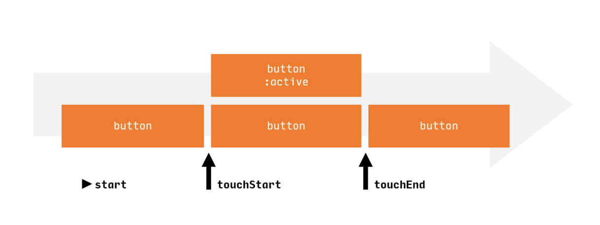
W3C STANDARD
On a touch device, if you comply with the W3C standard which discourages you from implementing support for a :hover trigger, then the number of possible style combinations would be reduced to 2, losing its original style completeness:
In this case, the problem only affects the completeness of visual styles - we can’t feel a translucent button anymore. In other cases, however, :hover is sometimes connected to necessary functional triggers. For instance:
1 | nav .menu { |
Let aside whether this implementation is a good UX design pattern, it’s an undeniable truth that many websites currently rely on such hovering triggers for things to work: You have to hover your mouse on someplace to expand the menu.
If :hover pseudo-state is not implemented or supported by the browsers, conceivably, they will lose market shares. At times when touch screens are relatively new technology, the most urgent requirement for them is to ensure as many sites to function correctly on their web browser as possible.
The other problem in this model is some unexpected appearances might happen - the combination where the :active state is triggered but not the :hover state. Either on a traditional device or in the web developer’s initial expectation, you can’t find a magnified button with opacity set to 100%. Here, you will.
This is a minor problem, but it sure may still cause potential inconveniences. Besides, unexpected behaviors should always be regarded as dangerous in computer science.
CONVENTION
Due to the issues in the W3C standard, an unorthodox interaction logic appeared and persisted, becoming the status quo:
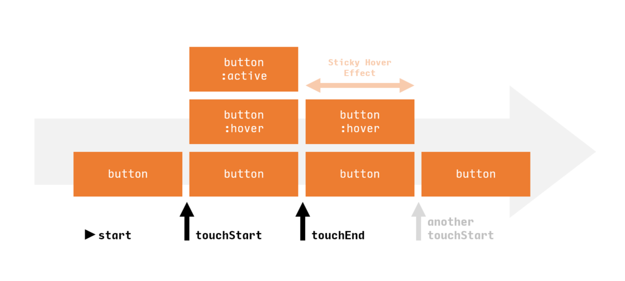
In this scheme, all three style combinations are preserved, ensuring the style completeness. It’s a safe solution, without a doubt, but it’s nonetheless ugly and disturbing. This scheme is the source cause of the sticky hover problem that we’re discussing today. Is there any other option?
A THIRD OPTION?
Indeed, apart from all the options mentioned above, there is another:
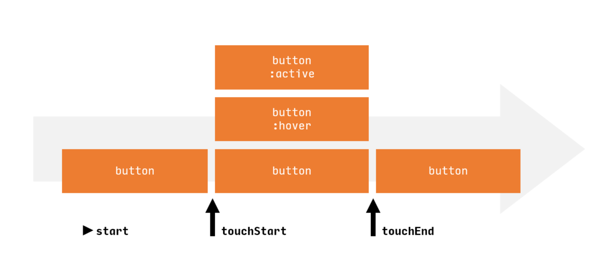
Notice there is only one difference from the W3C standard. Here, the :hover and :active states are always simultaneously triggered and deactivated. There is also only one difference from the current convention - the stage that causes the sticky hover effect is removed.
It mitigates the visual discomfort and eliminates unexpected styles, however, it still lacks style completeness. You can’t get the :hover style activated solely, and it’s difficult to retain the :hover state.
So, what’s good about this solution?
MY CHOICE
The third option is the solution that I use in my development.
One thing needs to be clear. The optimal solution for the browsers’ implementation is not necessarily the same as the optimal solution for a modern web app developer. From the perspective of looking after the whole existing web library, coming to this solution is not better than the status quo - It would break a lot of websites. On the other hand, if you are working on a new project, by adopting certain UX principles and guidelines, the negative influence can be circumvented.
One principle that I believe in is the interactive design pattern of hovering nav-menu mentioned above should be avoided. Although it used to prevail, I would frown this pattern.
The most common hovering menu activation is the Start Menu on some legacy Windows versions. To enter the next level of the menu, you need to continuously hover your mouse over the options in this level menu and carefully pan over. If you use the trackpad, it’s even more painful to move cautiously without accidentally leaving the track.
This interactive pattern was designed to save a single click. Yet, history tells us that “carefully staying on the hovering track” costs significantly more than a single click. If the hovering track area were broad enough, then the situation probably wouldn’t be so bad. But such a pattern often accompanies limited design space - after all, if there were abundant space, why don’t designers just put all menus simultaneously visible on the screen?
Though this pattern has seen a decline in usage, some UX designers have been working hard trying to improve it. On the home page of JD.com, the second-largest e-commerce site in Mainland China, we can still observe the presence of such a pattern. To offset its defects, however, a large amount of JavaScript code was written to predict the user’s next move by analyzing the mouse trace. As seen in Figure 5, when a user straightly moves their mouse from the top-level menu to the secondary menu on the right, although the mouse left the track during this movement, the content on the right would not unstably flash.
Despite all the efforts, no solution for this pattern could be both simple, elegant, and precise. No matter how complex and sophisticated the prediction algorithm is designed, misjudgments can happen.
The best use of :hover pseudo-states, from a modern web design view that fits both desktop and touch devices, should only be the style transition that provides proper visual feedback instead of doing anything functional imperative. Relying on hovering to trigger a menu itself probably would not be a good idea.
Other functions that rely on the hovering states, e.g., tooltips, are preserved and can be appropriately activated. A long press would do the work. But notice that tooltip is not the ideal interactive component on mobile devices as well.
CONCLUSION
In web development, The historical burden that a browser carries is often onerous. Bad or incorrect designs in legacy HTML, CSS, and JavaScript standards must be preserved to make sure old sites function properly. border-box in CSS and typeof null in JavaScript are all good examples for that. We should, therefore, understand the compromises that they had to make.
The developers, on the other hand, should actively seek new possibilities that may provide better solutions. It’s important for us to realize that we don’t have to always “keep in sync” with the current browser specifications.
It’s like we’ve forgotten who we are, Donald.
Explorers. Pioneers. Not caretakers.
—— Joseph A. Cooper, Interstellar, 2014