After several months of work, the project WePeiyang 4.0 React-Native is about to be released. Across the entire app, the Schedule module is a well-deserved, most knotty one for its elusive cases and complicated layouts.
When designing the product, however, the hardest part for me was “how to advance a further step.” WePeiyang itself has a ten years history of development, signifying the weight of its existing design decisions. The previous major version of WePeiyang, 3.0, has also been through the test of time. It is fully functional and, most importantly, robust, not requiring an immediate upgrade itself. Since I have decided to break this status quo and initiate a new version, there must be a good reason.
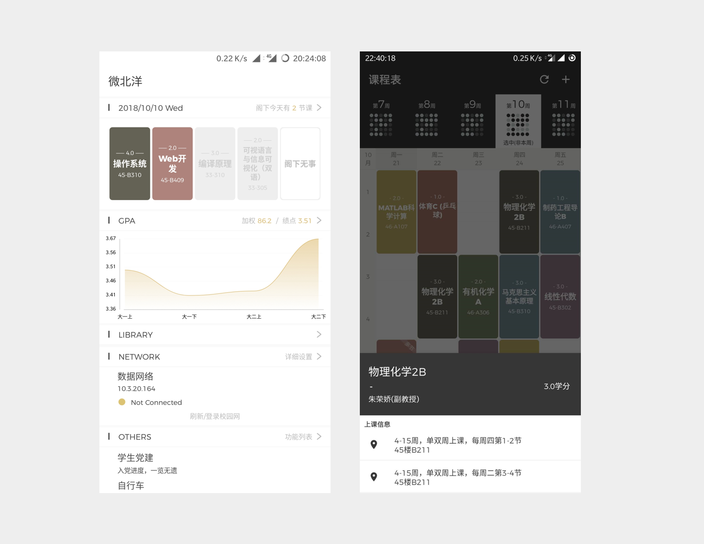
No more story-telling here. In the following pages, I will briefly describe the problems encountered in the requirement, design and development stages, and give an idea about how I managed to solve them.
Visual Identity Design
Although the development process didn’t start until June 2019, the origin of WePeiyang 4.0 can be traced back to a year ago. In 2018, Owlling worked on a conceptual design draft of the new generation of WePeiyang. This draft laid a base of what the application should look like in general. However, it didn’t implement the modules that involve relatively complex layout, e.g., GPA and Schedule.
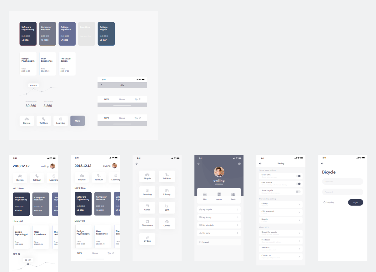
The “daily schedule” component in the home screen is essentially a horizontal ScrollView. Inside the view, all courses arranged today are shown linearly. Each course has an identity color, and each CourseBlock is essentially a rounded rectangle showing course information with a background of that color.
To ensure consistency across the daily schedule component in the home screen and the Schedule module, the identity color and the rounded rectangle shapes were adopted. In addition to this, the palette tone, heading style, TopBar component, and the modal that pops up after clicking on a CourseBlock are re-designed to keep consistency across this module and other modules.
Dotmap
Dotmap is a component that tells users how their time is occupied. It is introduced since WePeiyang 3.0. I’m not the one who designed it, but I like it very much.
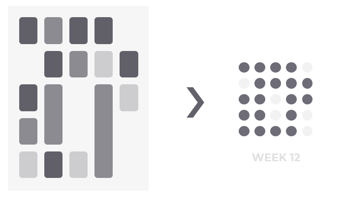
In WePeiyang 3.0, the Dotmap is a fixed 5×5 matrix, which means they can have hard-coded dot margin and component size. In WePeiyang 4.0, however, one notable feature is the variability and flexibility of course tables. Users are given choices on determining how many days they want to show each week. While most students have courses arranged between workdays, some of them need to take classes on weekends. If they choose to display from Monday to Sunday, inclusive, then the Dotmap should be of 7×5 size.
We need a more flexible component - for a flexible solution.
To implement such a Dotmap, the ideal layout model is CSS Grid Layout. Sadly, React-Native doesn’t ship with those fancy stuff. What should we do? It turns out that we can still achieve that using two nesting Flexbox Layouts. The core idea is to set the inner columns and dots flexboxes to justify-content: space-between.
If you catch this core idea, the actual implementation of Dotmap can be very concise and elegant.
1 | export function Dotmap(props: DotmapProps) { |
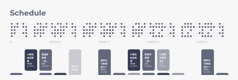
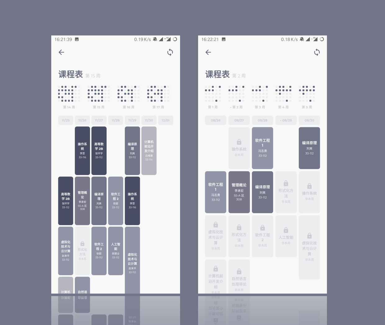
Runtime screenshots:
Layout
The schedule layout is inherited from the standard grid layout used in WePeiyang 3.0. We considered changing the design to a stacked linear structure so that the daily schedule component in the home screen can be reused to lower the development workload. However, while the stacked linear design is more commonly seen in apps designed in the west, students in China are more familiar with the grid layout since the elementary schools.
We decided to go with the grid.
The problem with this option is that all information needs to be displayed on the whole screen at once. The amount of information increases, the space becomes extremely limited, so we needed to eliminate all the unnecessary fields and make the width of a single course block compact.
Determining Canvas Size
To achieve a responsive layout, we need to make the layout parameters flexible or “computed.” The width of the schedule grid can be fixed (to the screen width minus the padding), but the overall height is variable. This variable height, by design, needs to satisfy each of the five requirements below:
- When the phone is in portrait mode, we need to secure a more towering height to make all information fit into the course blocks;
- When the phone is in landscape mode, reduce the height so the screen can display most of the schedule at once;
- On tablets, the course blocks should have a larger size than on landscape phones;
- When more days are displayed in a single week view, the rendered height needs to increase so that course information can fit into an even more narrow course block;
- In cases that the size still can’t be adequately auto-determined, allow users to specify a value to adjust it explicitly.
Design the following algorithm:
Where represents the overall rendered height, is the current window height returned from Dimensions.get(), represents the scale coefficient designated by users, stands for the margin heights, and stands for the displayed days each week. is the number of course slots each day, which identically equals to 12.
1 | // For height, you need to specify height of a single component, |
In the actual implementation, some other details were included as well. For example, when there are more days displayed each week, the margins between the columns would be decreased.
Placing Course Blocks
It’s easy. Define a vertical absolute layout, then calculate the top property according to the formula.
Note that sometimes, the top property may be adjusted to create offset to handle the conflicts. We’ll further discuss it later.
Drawing Course Blocks
There are infinite sizes of screens. This causes infinitely many possibilities of the calculated course blocks. A course block can be tall and skinny, squashed, or it can resemble a regular square. Therefore, we need to consider all possible circumstances and, if necessary, to adjust the inner layout in each course block individually.
The course block components displayed on the inner Schedule screen are called CourseBlockInners. A smart enough CourseBlockInner should meet the following requirements:
- The layout should be separately designed for the “tall and skinny” blocks and the “short and squatty” ones;
- The font size should be automatically calculated to fit the block;
- Similarly, in cases that the font size still can’t be adequately auto-determined, allow users to specify a value to scale it explicitly.
In the implementation, we designed the following logic:
- Calculate the font size according to the detected layout specs for the current course block;
- Preserve a coefficient field for font size adjustment;
- Set a threshold value for the detected width. Use the wide layout when the detected value is above the threshold, use another when below.
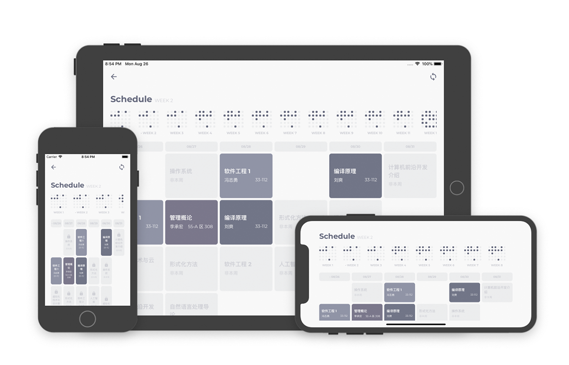
The code written here is mostly conditional styles; we’ll leave the code and won’t go any further into details. Anyway, the results were quite good when we did the actual testing - elegant layout and user experiences were preserved on a variety of screen sizes.
Resolving Scheduling Conflicts
What conflicts?
Just like any other timetables, several arrangements in a single time slot can cause conflicts.
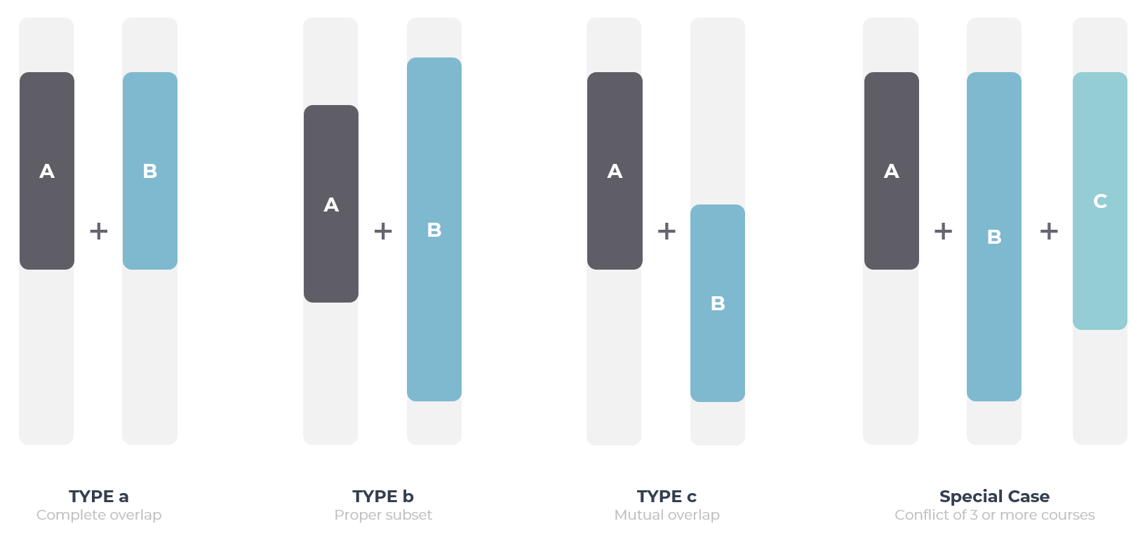
We can classify the conflicts into the following three types/categories:
- Complete overlap. E.g., two courses both arranged at 8:30 - 10:05 on the same day;
- (Proper) Subset overlap. E.g., two courses arranged on the same day, one at 8:30 - 9:15 and another at 8:30 - 10:05;
- Mutual overlap. E.g., two courses arranged on the same day, one at 8:30 - 10:55 and another at 10:05 - 12:00.
Apart from these, we may also face the case in which:
- Three or more courses engage in one single conflict.
In the course arrangements provided by Tianjin University Academic Affairs Office, conflicts are rare. Most conflicts fall within the category I, which results in the strange conflict handling algorithm designed in WePeiyang 3.0.
In the versions prior to WePeiyang 3.0, the idea, in general, is this: First, design an algorithm to decide whether two given courses conflict or not. secondly, traverse all course arrangements and find all the possible “conflict course clusters.” Then, for each cluster, render only one of them with a “conflict” label on it. When you tap such a labeled course block, all courses in this conflict course clusters appear in a popup modal.
This model was able to get by most of the conflicts in the official course arrangement, but it does not allow us to scale. Conceivably, as we introduce the “add your own events” feature in the near future, this algorithm would collapse.
How to render conflicts?
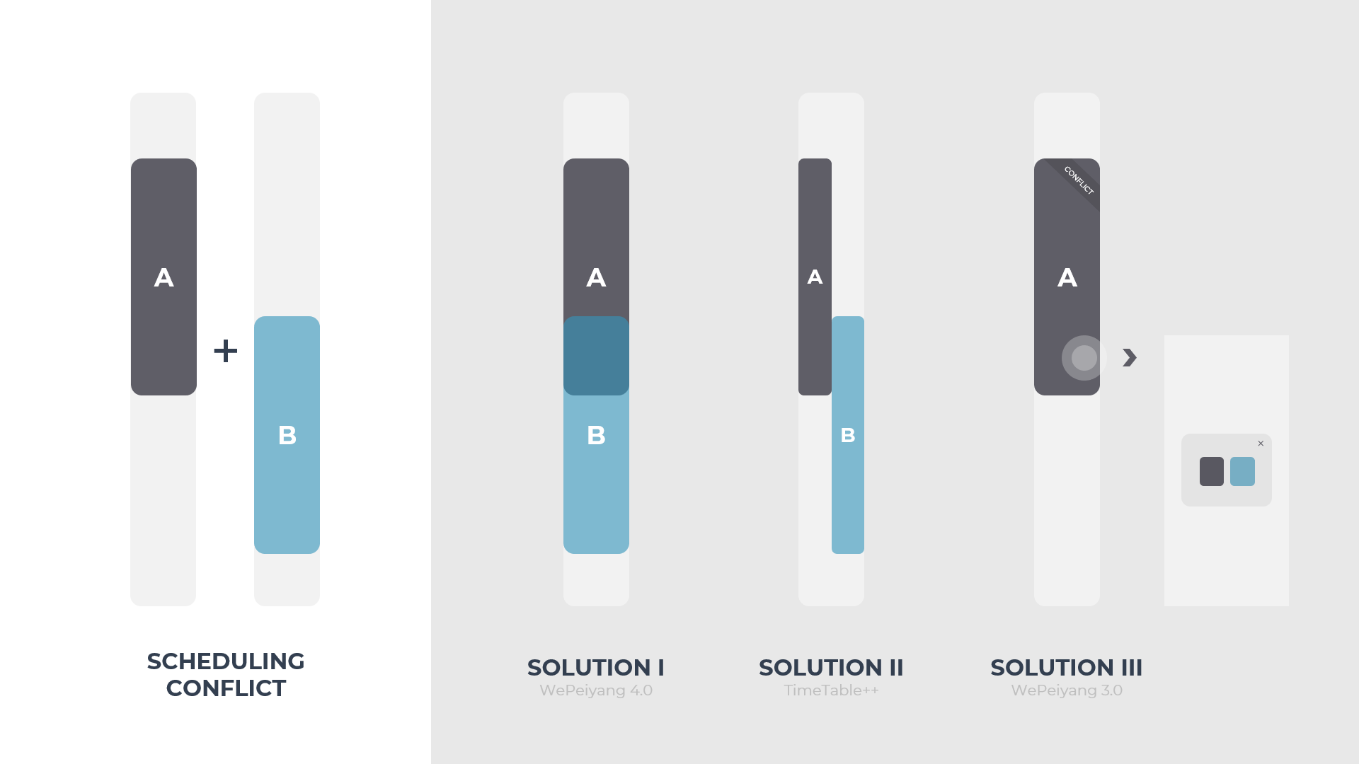
WePeiyang 3.0 decided to use Solution III, an algorithm only capable of solving one specific type of conflict and doesn’t satisfy the 4.0 requirements anymore. Suppose there were two overlapping course arrangements, one from 8 to 10 and another from 9 to 11. Using solution III, only one of them would be rendered. Although you can see the conflict details via the popup modal, the time slot in the schedule view would still appear to be vacant though there were actual events. This behavior violates one basic rule in our UX design guidelines - “Not implementing is better than misleading.”
Some other apps, for instance, TimeTable++ on Android, chose to split the track and parallel-render those conflicting events (Solution II). This might be the optimal solution for general scheduling apps, but for WePeiyang 4.0, it severely reduces the already limited space and meanwhile sacrifices the UI appearance.
At last, WePeiyang 4.0 adopted an overlay rendering solution (Solution I). One primary advantage of it is the good perseverance of the original visual elegance and consistency. Still, we need to solve two problems first. One is to ensure that all the course information is “exposed” (i.e., seeable). Also, we need to avoid overlapping one course with another completely in rendering and making it untappable.
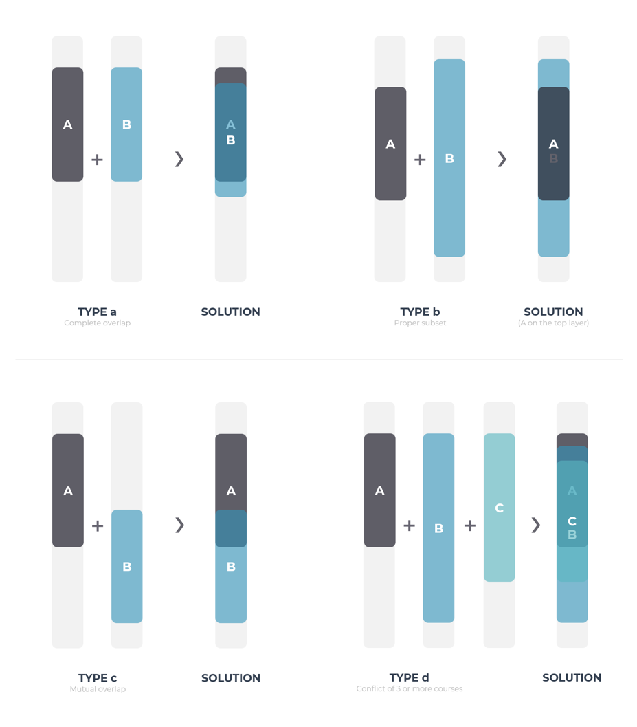
The first problem can be solved by giving the course blocks some translucency.
In the visual identity system designed for WePeiyang 4.0, each course has its hashed identity color. Here, we can assign a more transparent color to a course with more credits while ensuring the alpha value be no higher than 0.9.
1 | const defaultPalette = { |
This design utilized the nuanced connection between the importance of the course and the credits of it. For users, or at least from our students’ experiences, we tend to care more about the courses with a higher number of credits, hence giving more priority. By assigning the opacity this way, we can ensure that when several course arrangements conflict, the more important arrangement is more “salient,” thus more noticeable in the schedule view.
The second problem, on the other hand, is solved by a composition of “giving each of the courses in a conflict some incremental offset/translation“ and “making sure the course starts later would be the course rendered on the top“. The latter only requires the courses are sorted by start time. The former one can be tackled by the following code:
1 | let crashIndex = 0 |
In the above code snippet, crashIndex keeps track of the current accumulated courses with the same start time. For the th of such a course, the render position will be translated by pixels. Once a new course with a different start time is detected, crashIndex is reset to zero.
At this point, we can appropriately render all four conflict types mentioned earlier. We ensured that all courses are visible, clickable, and the more critical courses appear more salient.
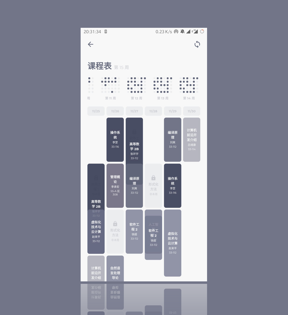
Dealing with Not-This-Week Courses
Not-This-Week courses are courses arranged in other weeks. So, should we display them in the current week?
WePeiyang has a long history of displaying not-this-week courses. They were rendered as light grey boxes with a “not-this-week” ribbon in the corner. Implementing them seems quite easy, but no. Just to illustrate an example: suppose course A is arranged in week 2-8, course B is scheduled at the same time slot but in week 9-16. What do we display in that time slot when the current week is week 1, course A or course B?
When I investigated code in WePeiyang 3.0, it seems that they didn’t specifically handle this case - it will just display one of them and abandon all other not-this-week courses. Not an elegant solution.
The problem gets knotty when we consider overlapping conflicts. What if courses A and B are partially overlapping? What if three or more courses are engaged in this conflict?
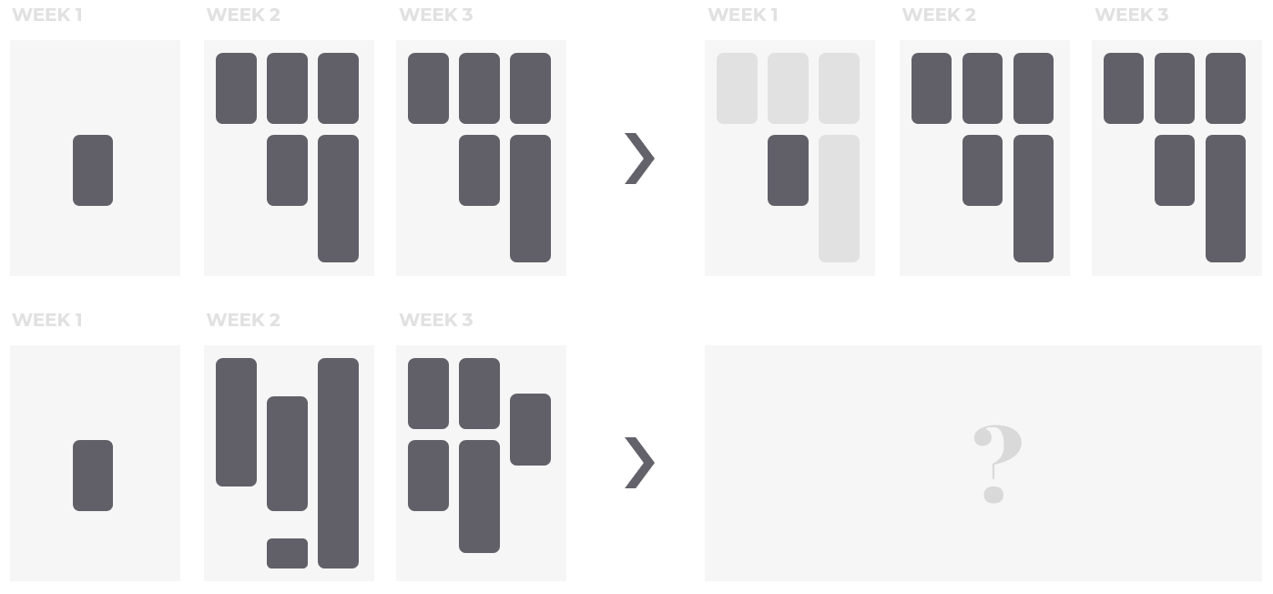
That’s right. Not-this-week courses can conflict with themselves, too. When this happens, it makes no sense to display only one of them. It’s not even a problem of anti-elegance. It’s misleading.
Similarly, while the current WePeiyang suffers from this issue, they are not widely triggered or noticed since such a form of conflict is not common. And again, after we introduce the custom events feature, we can’t just get by anymore. We need a new model.
Before we came up with the conflict handling model, the only way to solve it is like this:
Calculate the time slots that are vacant every week. Its complement then represents the time slots that have at least one not-this-week course occupied. When rendering regular courses, render all those time slots in the layer beneath, tag them as “Possible not-this-week courses are located here.” As for which time slot corresponds with what specific course, logically, we can’t decide, because the overlapping conflicts are making these vacant time slots amorphous.
This solution, though theoretically feasible, brings a tremendous amount of code and rendering logic that is more difficult for future generations to maintain. We are almost about to give up rendering not-this-week courses altogether. After designing the conflict rendering scheme for the regular courses, we realized that this scheme could also be applied to not-this-week courses. The difference is that there is no need to handle positional offsets for them because they are inherently unclickable by design.
This reuse solves the problem at a relatively low cost. No more misleading vacancies, and the not-this-week courses can be rendered with names.

In my personal view, however, displaying not-this-week arrangements itself is an anti-pattern for time tables. Implementing it here is only to take care of users’ existing habits; so, we provided the option not to display such courses. Enabling this would mark the vacant days (according to only the current week’s arrangement) with a random activity icon instead of marking the not-this-week courses.
Caching
The function getFullSchedule() calculates the schedule for each week in the current semester. It invokes getCoursesByDay() for each day in the semester. These two are relatively complicated functions even on the whole WePeiyang app scale.
1 | export const getFullSchedule = (data, daysEachWeek) => { |
Due to the fact that getFullSchedule() is a costly operation with a cubic polynomial complexity (We could have designed a more efficient algorithm, but the current one allows us to scale up for a custom event module), if we run this function every time a user enters the schedule view, the performance would suffer.
Therefore, caching is necessary.
1 | if (course.generated && course.generated[0].days.length === daysEachWeek) { |
The above code stores the generated schedule details in the Redux Store, and then use redux-persist to persist the data.
Meanwhile, the getFullSchedule() is invoked as well when users attempt to refresh the data from remote servers to ensure data integrity and consistency. This costly action can be safely omitted here because the network request is usually more time-consuming than local computation.
Afterwords
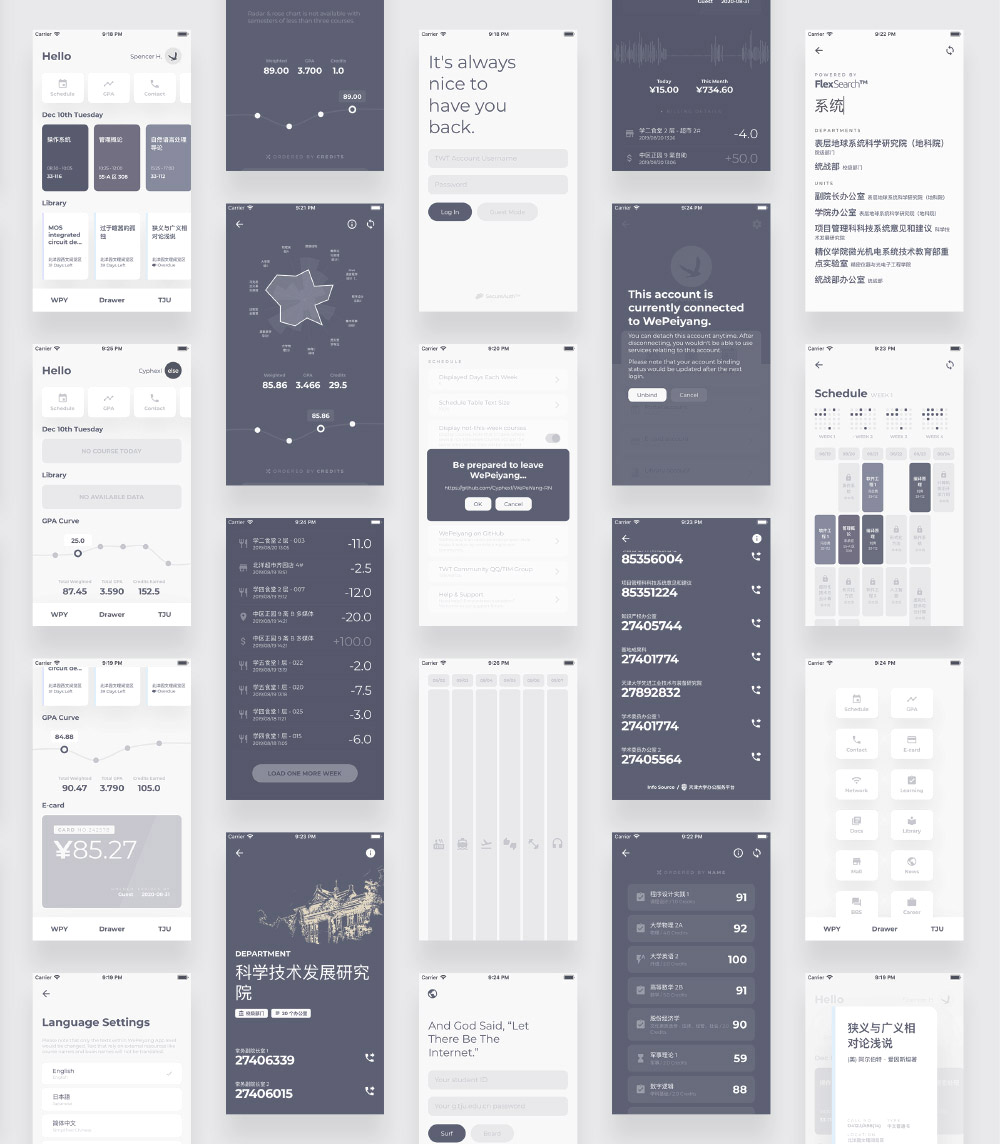
Software engineering is a complex subject. We do not only need computer scientists proficient in C++ and data structures. When developing user interfaces, some visual mapping techniques for real-world problems and an adequate understanding of how human behaviors work can weigh more than an sophisticatedly optimized algorithm.