You’re a young adult who lives alone in a megacity. You decided to rent an eight-square-meter subdivided flat that costs almost half of your monthly income. There is a huge rail transit system in the city. Because you needed to commute, you chose to live by a subway station.
But which one?
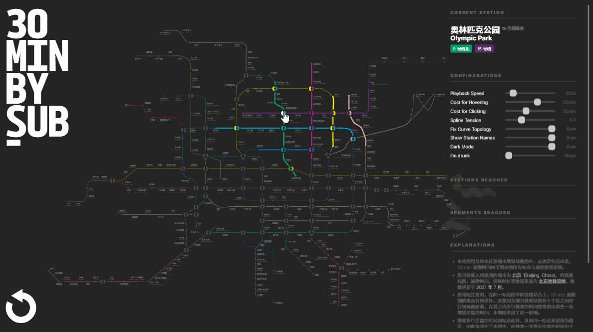
Before making the decision, you would like to know a little bit about the commute radius of several stations. You want to see where you can reach within a certain amount of time.
Theoretically, this could be easily calculated by hand. When I faced this decision-making situation, however, I couldn’t stop thinking about whether there could be a way to visualize and animate it in a visual approach. I decided to code a map.
Data Collection and Preprocessing
Before setting out for anything, we need to make sure there are data available. I’m currently living and working in Beijing. Let’s find a subway map there.
The Map
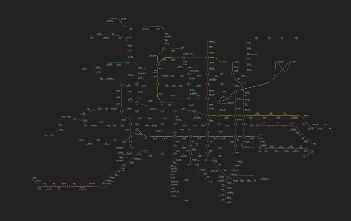
The complete map data for Beijing Subway is made public on its official website. It involves some degree of interactivity, meaning it can’t be a plain rasterized bitmap image. This will be our primary source of data to redraw our map.
Similar websites can be found for most urban rail transit systems in China. If you can’t find one for the city you’re living in, then you might want to consider pulling the data from a public geographic database like OpenStreetMap. Maps of this kind will be geographically precise, undistorted, and may require further editing for aesthetic and legibility concerns. Transformation of a railway map is not at all trivial and could develop a separate article. We won’t focus on that for the time being.
Time Between the Stations
The map is static. It doesn’t contain the data we need to calculate the commute radius for a specific time. Apparently, you can access data like this by a map app. You can even spend a day traveling and record the time with a stopwatch.
We won’t bother with it this time, because travel time information is provided by the website as well. Huge amount of time saved. (pun intended)
Time Inside the Stations?
Fun fact: In Beijing Subway, the shortest distance between two adjacent stations is 424m. The longest walking distance for transferring inside a station, however, is over 500m. Despite this outlier, there are still several other interchanges that might waste you more than five minutes to switch to another line. We can’t neglect them.
It’s somewhat tricky to get the data for intra-station commute times. Sources from which we could make use of are:
- Field investigation. Walk all the interchanges and record the times by ourselves.
- Measuring on the map. Though it might not be accurate, measuring the distance between substations on a large-scale map would be the easiest and most convenient way to estimate the transfer time.
- Using existing data. Z. Song et al. published an exhaustive collection of all possible transfer routes and their respective distances for Beijing Subway in 2016. However, many interchange stations have been added or restructured since then, and some of these data are obsolete.
What we decided to go with is a comprehensive approach - include any available data of these three sources for each interchange station, and find the average.
On the other hand, this issue regarding the transfer walking time brought challenges not only for data, but for designing and implementing our application as well. We’ll talk about them later.
Formatting the Data
After collecting all the data needed, the next step is to format the data. We split a dedicated preprocessing module for this task.
First, we prepare an empty data structure. We’ll need a list and a dictionary, so the structure should look like this:
1 | const subway = { |
Inside the dict, the schema for lines and stations should generate the following objects:
1 | // Example: Line 14 (West) |
The preprocessing module is divided into four steps.
- Iterate all
ls andps in the XML to generate data for lines and stations. This generates a rough structure that matches the above schema. - Iterate all
exs to fill in additional data for interchange stations. This step will fill the interchange stations with the correct substation data, including their adjacents but excluding traveling time. - Fill additional stations info, including translation, lat/lon, etc. These pieces of information are used mostly for display purposes. They won’t affect our main calculation process.
- Fetch route information (timetable) for each line. This step completes the missing traveling time for the adjacent stations of each station and gives us the actual ability to calculate the commute circle.
Note that the above preprocessing logic is available only for the XML data format provided by the Beijing Subway official website. If you collect data from somewhere else or for another subway system, you should use your own preprocessor script.
Drawing The Perfect Subway Map
Before making the map into anything dynamic, we need first to determine how the map should be drawn.
The major problem here, as you might guess, is drawing lines through subway stations. Currently, our data covers each line’s station sequence and their individual coordinates, but not the continuous line shape. The most obvious solution is to simply connect these stations using straight lines. However, a subway map with bumpy polylines surely ain’t gonna look good. We want curves.
Choosing the Spline
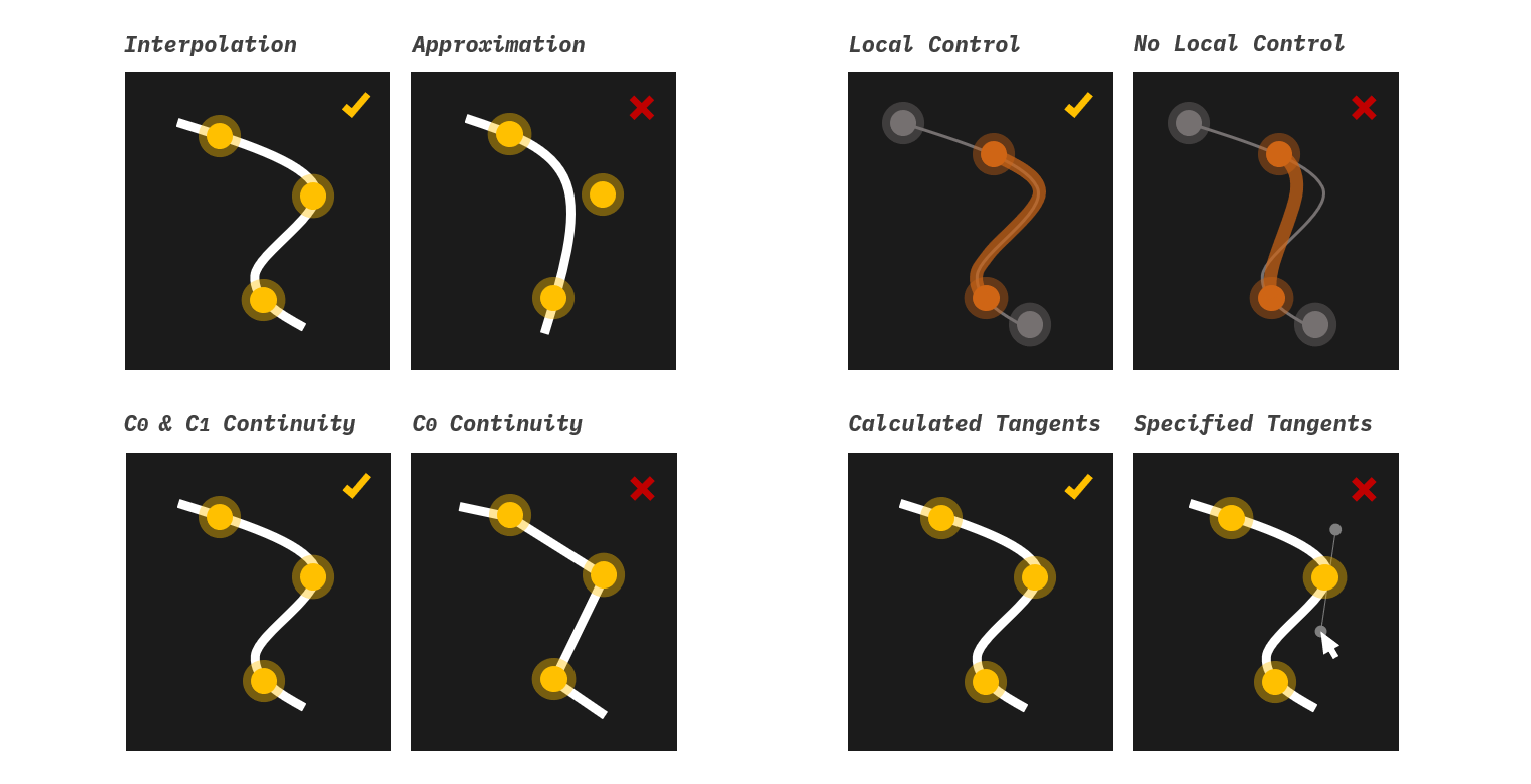
The technique used to generate curves or motion trajectories that pass through specified points is called Spline interpolation. Though splines come in vastly different types and options, the chosen one must meet the following requirements for our app renderer:
Exact interpolation. The resulting curve must go exactly through, not near, the control points. This rules out all approximating splines, including B-spline and Bézier Curves.
Local control. Because our map involves drawing segments within the complete line, we need to ensure the curve of the entire station sequence looks identical with the curve of any continuous subset of that sequence in that interval, so they can perfectly overlap in the renderer. Achieving this requires the spline has local control. This term may look obscure to you; we’ll explain in detail later.
Continuity. The resulting curve should at least have and continuity, meaning it should be continuous in both position and tangent vector.
Automatic tangents. Explicitly specifying all the tangent vectors for each endpoint during render would be costly and tedious. Continuous tangents must be built-in. This rules out Basic Hermite Splines.
Preferably, this type of spline should be directly supported by
d3.curve. While I concede it’s generally impressive to code a dedicated interpolation algorithm, we need to balance research with some engineering in our app. Always avoid reinventing the wheel.
Catmull–Rom spline is ideal, as it satisfies all five conditions above. To configure this type of curve in d3, we just use d3.curveCardinal.tension(0.5). A cardinal spline is obtained if we use the following equation to calculate the tangents:
where for is the set of points to interpolate. The parameter is a tension parameter, where using yields a linear interpolation (i.e., no smooth curves), and using yields a Catmull–Rom spline. In practice, we made this parameter adjustable on the control panel, so users can still tweak it to get the subway map in a polyline style.
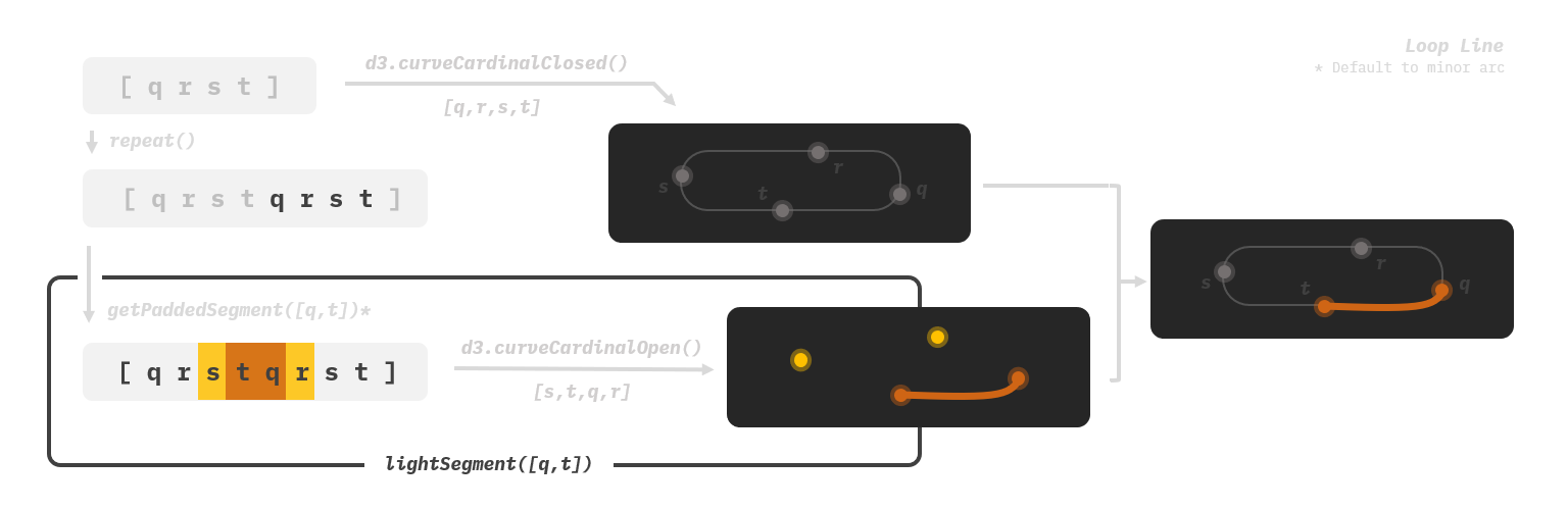
Stabilizing the Curve
This paragraph serves to explain in detail what Local Control means and why we need it.
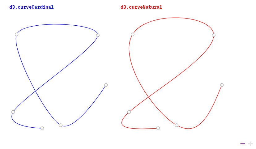
Interpolations without local control mean a change to any control point affects the entire curve. With this type of spline, when rendering a sequence subset layer over the base layer, it’s likely that the layers will produce unidentical curves for the same interval, causing intersection and visual disturbance. d3.curveNatural is a good example of this:
However, simply choosing a spline with local control does not solve all the problems. Local control guarantees only the visual stability of the “middle section” of the entire curve. The shapes of the head and tail segments will always be affected by the first and the last control points. Unfortunately, this is a price that must be paid in exchange for achieving continuity.
We clearly need all segments to be visually identical when overlapping lines. How to deal with this?
The solution I came up with is to pad the arrays. Instead of injecting the coordinates of a station sequence into d3.curveCardinal(), we first extend the array with additional previous and next stations, and then pass it to d3.curveCardinalOpen(), which does not draw the head and tail segments at all. In case the sequence has already covered one end and does not have a previous or next station (happens only in non-loop lines), then it just repeats the endpoint. These invisible padded stations, though look like redundant data, grimly do their work behind the scene to keep our curves stable. I have no clue if it’s the standard solution to these types of problems. It does, however, elegantly and painlessly solve the problem.
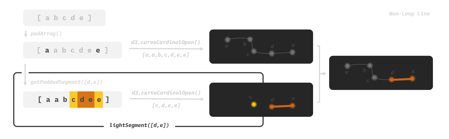
In our code, the padding logics to handle loop lines and non-loop lines are slightly different. To prevent false overflow, loop lines are repeated twice into a longer array before producing segments to pad.
1 | const padArray = arr => arr.length ? [ |
Introducing Auxiliary Stations
By now, the shape of the curves will be calculated and solely determined by the location of actual stations. However, there are circumstances that we might want to manually adjust the curves.
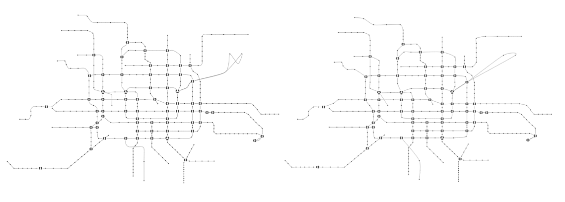
Consider two stations with a great distance. Between them, the actual traveling route is zigzagged, which sadly won’t be shown when we interpolate our splines based on stations. Or, consider two intersecting lines. The position of the intersection doesn’t accurately represent the real situation. These are all examples of why we might need to ability to tweak the curve.
Auxiliary stations can be used to deal with this issue. They are station-like data structures inserted into our subway map lines, but with an isAux property and could be easily filtered when we don’t want them - e.g., when rendering station names and enabling click interactions. All they do is guide how our curves will be drawn.
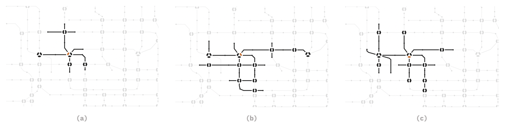
A subway map without auxiliary stations is still readable, but is probably uglier, much more abstract, and sometimes does not reflect the actual topology of the lines. Below is a comparison of the subway map in our interface.
Pinning the Stations
Compared to lines, drawing stations is rather trivial. For an ordinary station, we just pin a dot using SVG <circle/>. For interchange stations, my idea is to try spanning arcs of different colors to form tiny pie charts. d3.arc does that for us, though it’s a bit difficult to use:
1 | export const generateArcPathForSubstation = (sub, returnCentroid) => { |
Placing the Text Boxes
The last step of drawing a map is to place the station names. Ideally, these texts should not overlap with the lines, and should maintain proper spacings with all surrounding elements. While placing text in a subway map usually involves manual tuning, there are ways to make this easier.
The positioning patterns for placing station names often occur by segments. This leaves explicitly specifying the text positioning for each station unnecessary. For example, for Yanfang and Fangshan Line, the text positioning can be divided into three segments according to curve direction:
- For the first segment 燕山 Yanshan to 房山城关 Fangshan Chengguan, the station names can be positioned top-right.
- For the second segment 饶乐府 Raolefu to 良乡大学城西 Liangxiang Univ. Town West, the station names should be positioned up-and-down-interlaced.
- For the third segment 良乡大学城 Liangxiang Univ. Town to 东管头南 Dongguantou Nan (S), they can be positioned bottom-right.
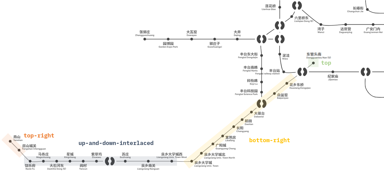
Sometimes, we still need fine-grained control for individual stations. Take the above line for instance; it’s better to place the text for 东管头南 Dongguantou Nan (S) in the top position. This prevents it from being confused with the nearby ones.
To achieve all the above, we designed a station -> segment -> default general fallback mechanism. It receives definitions for station-based, and segment-based text offset functions and outputs text positioning data for all stations in the entire map. For implementation details, please refer to module textOffset.js.
A Sprinkle of Interactivity
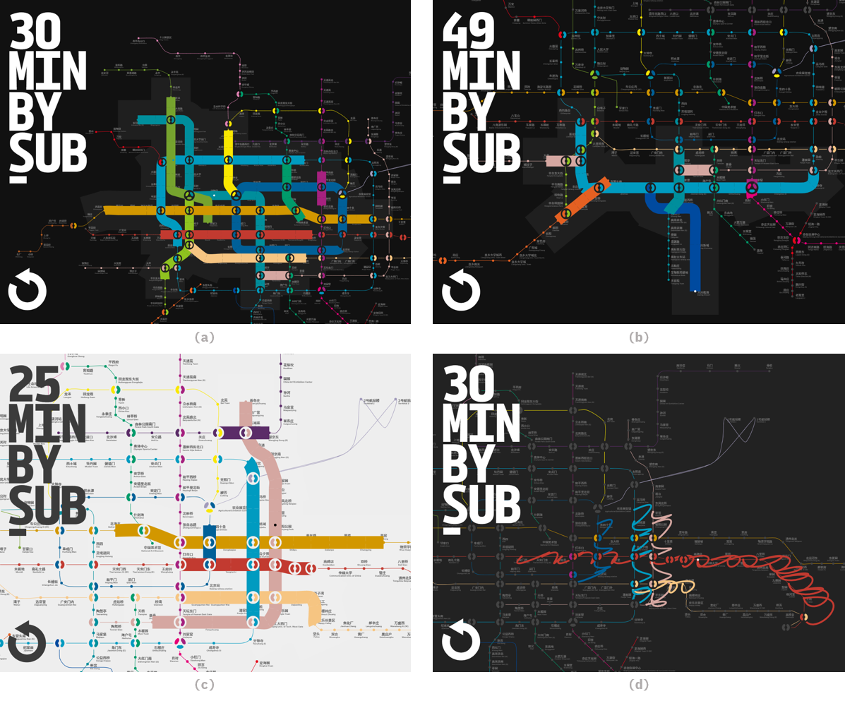
Calculating the Reachable Scope
A rigorous description of “calculating the 30-minute commute circle in a subway network” would be this:
Given a graph , a starting node and a cost constant , find the set of node-distance tuples , where is the distance between and node .
While it might be counter-intuitive, this problem does not fall into a common category in the graph theory field. It is a no-so-common variant in the huge family tree of shortest path problems.
Factors adding complexity to this problem include:
- Storing edges. We do not only need the set of stations reached - it’s not sufficient. We also need the set of edges passed through to display the highlighted intervals in the UI.
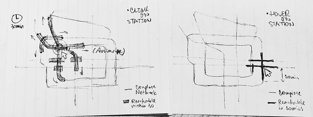
- Controlling the animation. The UI is designed to highlight the reached stations and segments at a configured pace when users click on a station. The searching procedure should accompany timers and frame controls.
- Encoding the data. Objects in Sets in JavaScript are stored by reference. We need to implement encoders to transform the data into types stored by value as well as the corresponding decoders to retrieve them.
Besides those, performance is also something worth keeping an eye on. Although our graph isn’t huge, the interaction frequency is high. The computation procedure will be triggered each time when the user’s mouse moves from one station to another, which can be up to 30 times per second. An easier option would be to throttle the interaction, but faster computation logic delivers a far smoother user experience. Since searching in a graph’s adjacency list is typically done using recursion, we could maintain memorized collections to stop recursive calls under certain conditions. This measure significantly reduces the number of recursions. In an experiment where the starting node is Xizhi Men on Line 13, the iterations dropped from 13,000 to less than 600.
The code for searching in the graph is written as below. Kudos to the effort we made to abstract and split all possible utility functions into separate files; it is optimized to below 100 lines. Desirable for a heavy function like this.
1 | export const updateActiveEls = (startingNode, clicked) => { |
Enhancing Interaction
When users interact with our map, they need to hover or click on a station element. Apparently, these stations are too tiny. While simply increasing the interactive radius for them does help, it may cause overlap, and does not work well in those densely distributed areas. This is when Voronoi diagram comes to the rescue.
No mathematician or computer scientist can resist the beauty of these diagrams. Here’s a Voronoi diagram of our subway map:
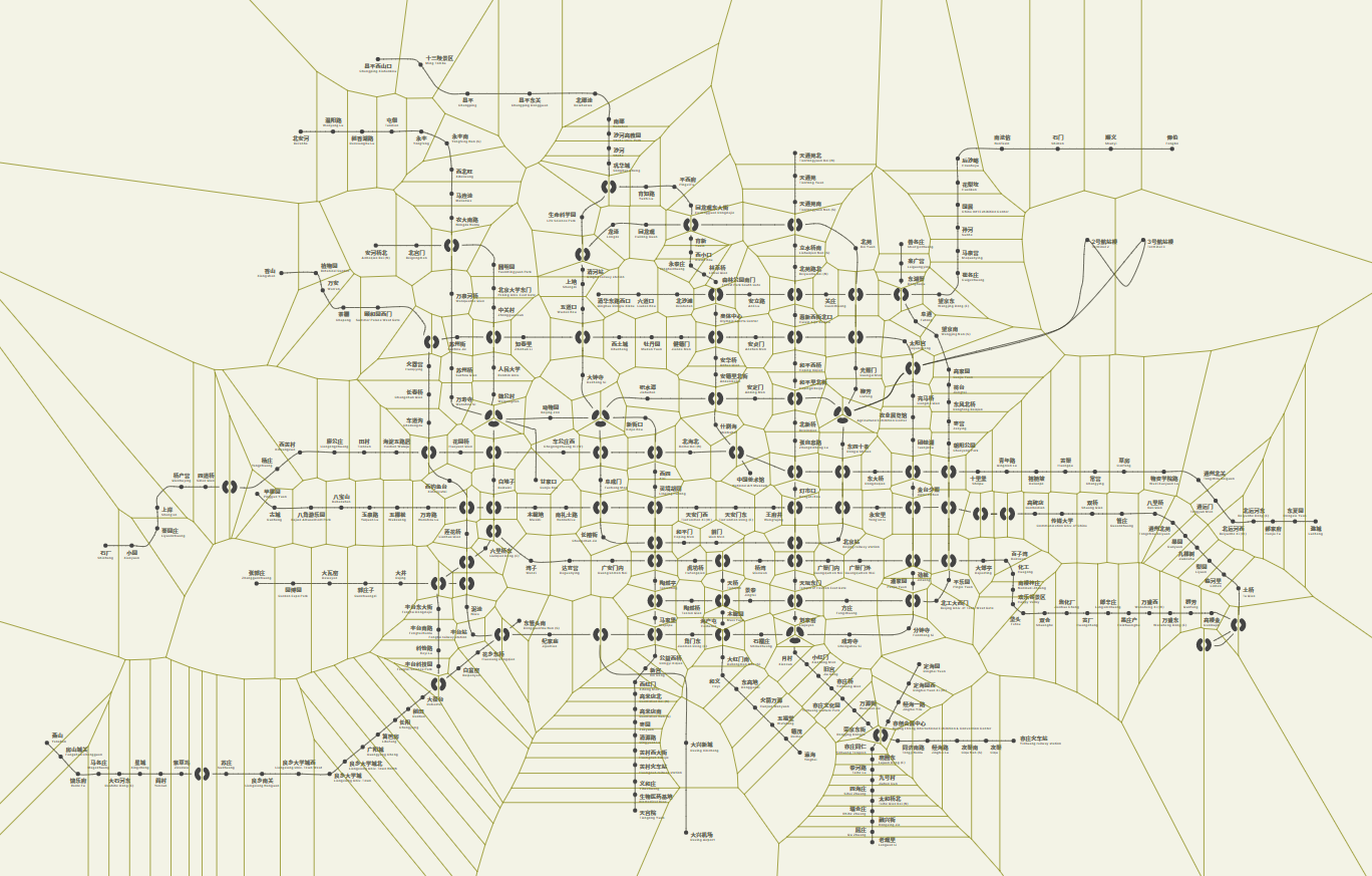
To compute a Voronoi diagram, we need first to do a Delaunay Triangulation. There are several efficient algorithms applicable for two-dimensional point sets that we could make use of. One gotcha though - you would want to define the interactive area as the intersection of the maximum interactive radius and the Voronoi cells. Otherwise, the territories for several terminal stations would be unreasonably large.
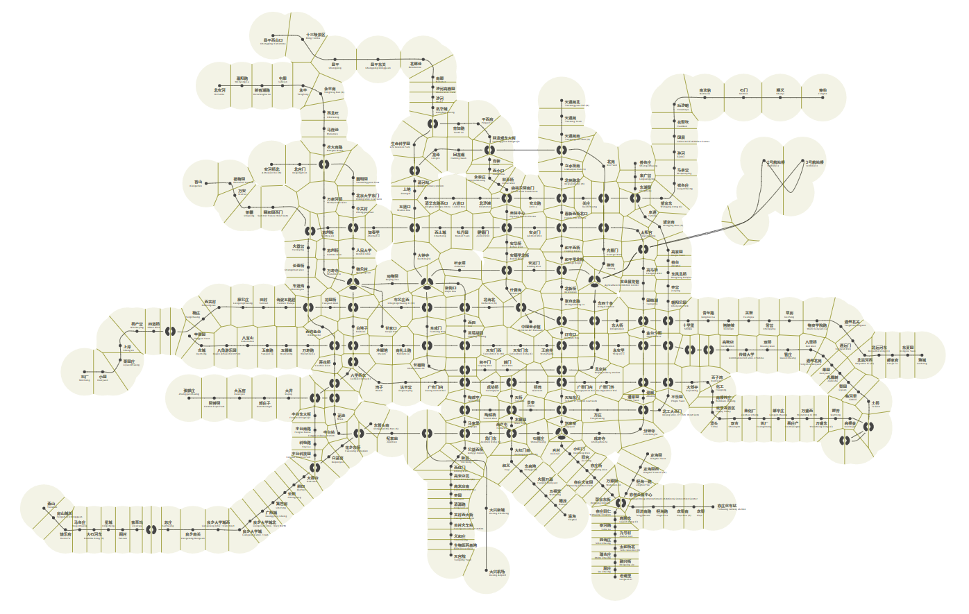
Assigning the interaction areas to these cells also achieves a seamless experience when switching between stations. As far as I can tell, it’s quite satisfying.
Building the Controls
Adding the controls means users can modify the states that might completely change the appearance and render logic of our app. For applications of this scale, it’s better to adopt a state-driven (data-driven) architecture.
We exported a global store of our app that contains all configurable options. When a rendering process depends on one or more states, we just get them using these methods provided.
1 | const store = { |
Comparing the traditional, jQuery-styled way that manipulates all affected elements each time the state changes, a state-driven design is much cleaner: You just call that method. This pattern also enables a more concise, straightforward, declarative way when implementing the configuration panel.
1 | const configurables = [ |
Closing Words
Good news - we’re all set! Check out the live demo here and have fun playing with it.

When I started this project, I had no idea it would grow into this. At this stage, it seem to be too much for a simple “where I should rent a flat” idea. - Yes, I should admit that.
I believe there are also existing similar attempts made to calculate commute time and render better commute radius maps. This webpage is probably nothing compared to the wide scale and sophisticated algorithms under tech giants like Google Maps. Still, I hope it does provide a unique and intriguing perspective of the subway networks which we travel by every day.